
Georgia gives us some tips on creating spruce top planters!
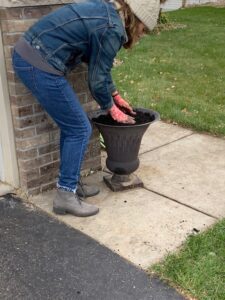
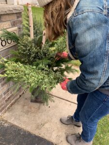
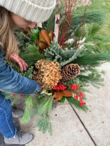
I always make sure my soil is loose and thawed. Make sure the container is filled to the top with soil to help support the stems that are going into the pot. For this look I put the birch poles straight up and made sure they went into the soil about 6 inches. I took my spruce tops and used the tallest one in the center. If there is a flat or sparse side, turn that towards the center of the pot.
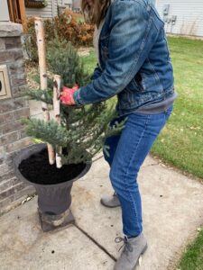
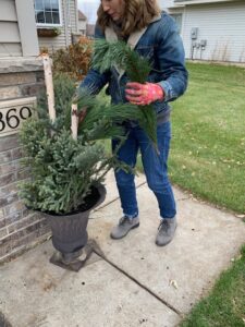
Next comes the Norway Pine. I like the sturdiness of this green and the height that it adds to the center of the planter. It helps to fill in nicely especially if the spruce tops are sparse. I use balsam or Douglas branches off of my trees to fill in around the base with white pine tips or boughs depending on the size of the install that I am doing to fill in as well. For a bit of color variation in this look, I used oregonia to help separate the sea of evergreen color.
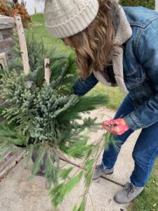
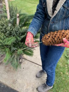
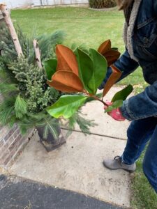
Once I have the planter nice and full with greenery, I like to start with my embellishments. I used a sugar cone for this install. I drilled (very slowly) using a small bit into the bottom of the sugar cone and then glued a hyacinth stick into the bottom. I put the sugar cone a bit to the right knowing I was going to put dried hydrangea in as well. Magnolia came next, I centered a larger piece straight up in the center of the pot in front of the birch poles and then tucked a piece to the left to balance the sugar cone on the right. I put my sugar cone and magnolia in first because they are beefy and I didn’t want them to crush my hydrangea. I added red painted branches in the center with the birch poles, this helps to draw the red color throughout the arrangement.
I cut long stems of hydrangea once they are dried and use them in my winter planters. Choose ones with thicker stems, enter them into the soil gently, and they will stay just fine. Nestle them in the arrangement. I also like to spray them with a good coat of Aqua Net hairspray!
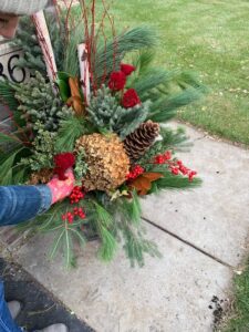
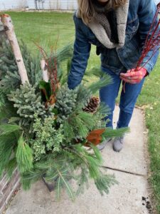
My color scheme on this look was browns and red, a more modern rustic color scheme. Berries and red painted yarrow are next. I tucked them in as groupings of red. Not groupings of element, but groupings of color. This gives visual interest the design. I love using terra cotta painted seeded eucalyptus as a brown tone in this look. I tucked it where my eye told me a splash of brown was needed. This color and the texture help to give dimension to the pot. Using various different textures of greenery gives you a professional look, you want to use greens with different tones and textures to give dimension and visual interest, which is key to a lovely looking pot.
Finally, I heated my cup of tea and enjoyed!